
Tallyway
Tallyway
Subscription Management Platform
Overview
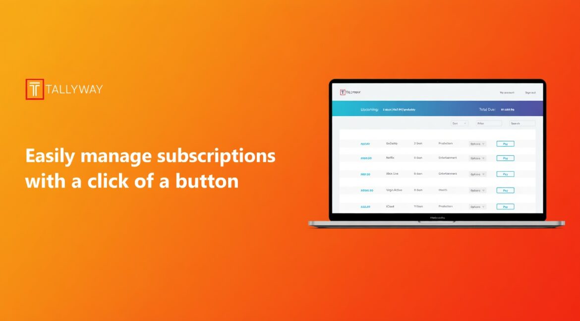
Tallyway is a financial management tool that enables users to manage subscriptions and receive notifications when a bill is due. users can monitor subscriptions and cancel unwanted subscriptions.
My Role
UX/UI
You can view the prototype I made in figma using this link: https://www.figma.com/proto/3ZlgjSCVM2Ilfw85A9K6pw/Untitled?node-id=0%3A3&scaling=scale-down
The Problem
Users often subscribe to multiple services but lose track of them over time, leading to unnecessary spending.
Most financial tools focus on transactions—not recurring subscription behavior—making it difficult for users to stay in control.
Key Insight
Users don’t forget subscriptions because they don’t care—
they forget because they can’t see them clearly in one place.
Opportunity
Design a system that makes subscriptions:
- Visible
- Easy to understand
- Quick to act on
The Solution
A centralised dashboard that allows users to:
- View all active subscriptions
- Understand spending at a glance
- Cancel services quickly with minimal friction
Design Approach
The interface was designed to prioritize clarity and speed.
Instead of complex financial visuals, the focus was on a clean, structured layout that allows users to quickly scan and take action.
Key considerations:
- Clear visual hierarchy
- Minimal cognitive load
- Fast interaction for key actions
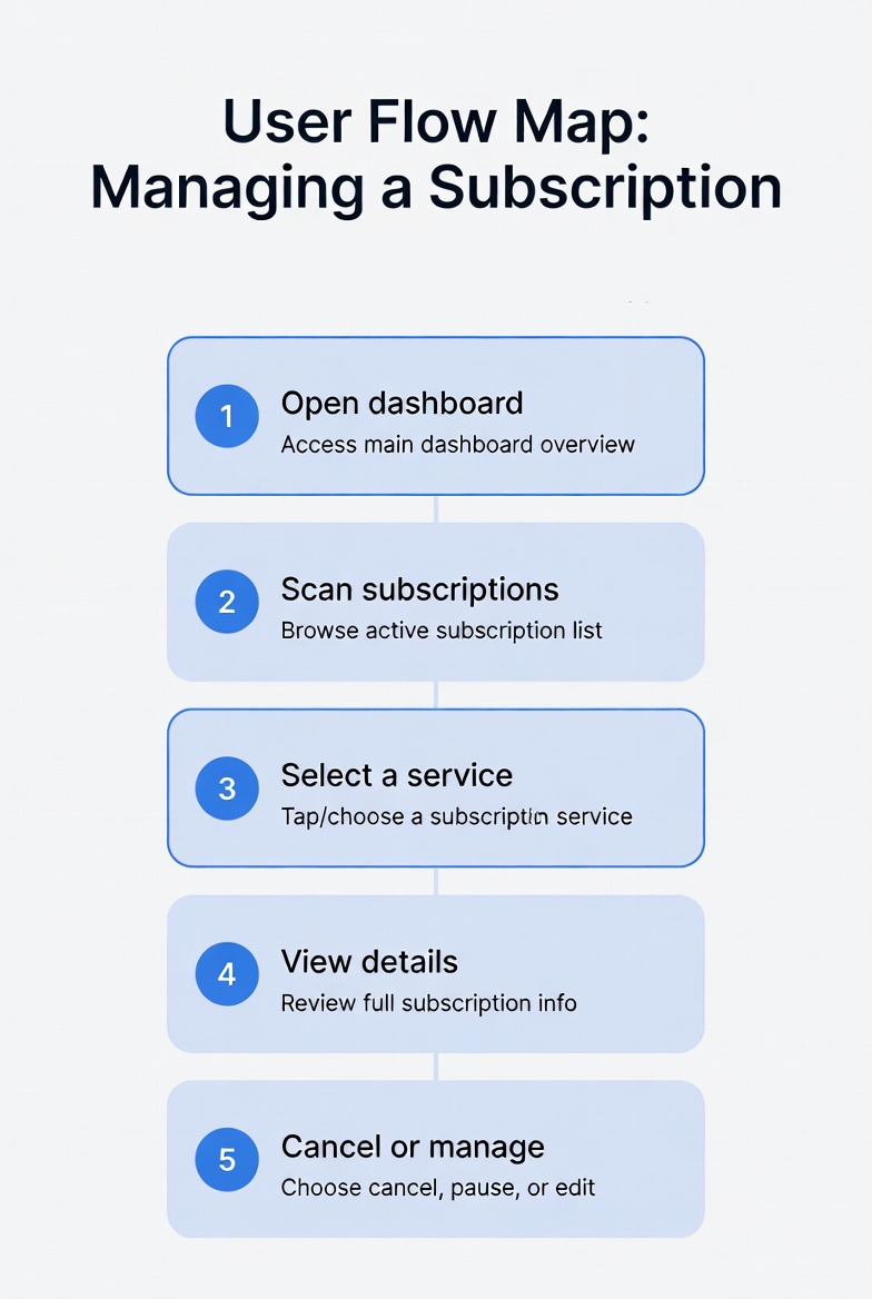
User Flow
Flow: Managing a Subscription
- Open dashboard
- Scan subscriptions
- Select a service
- View details
- Cancel or manage
Goal: Reduce steps and make actions obvious
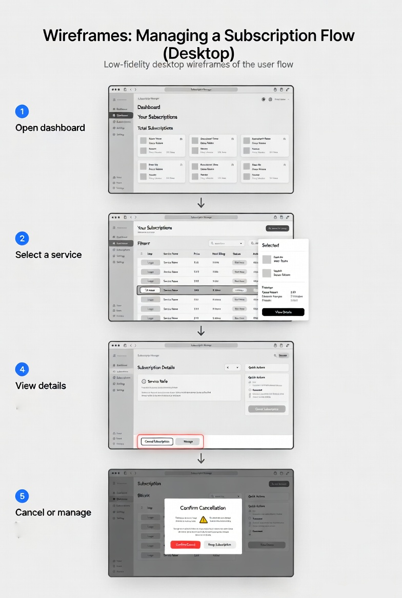
Wireframes / Exploration
Exploration
Early sketches were used to define:
- Layout structure
- Information grouping
- Key interaction points


Key Decision
A list-based layout was chosen for better readability and quick scanning.
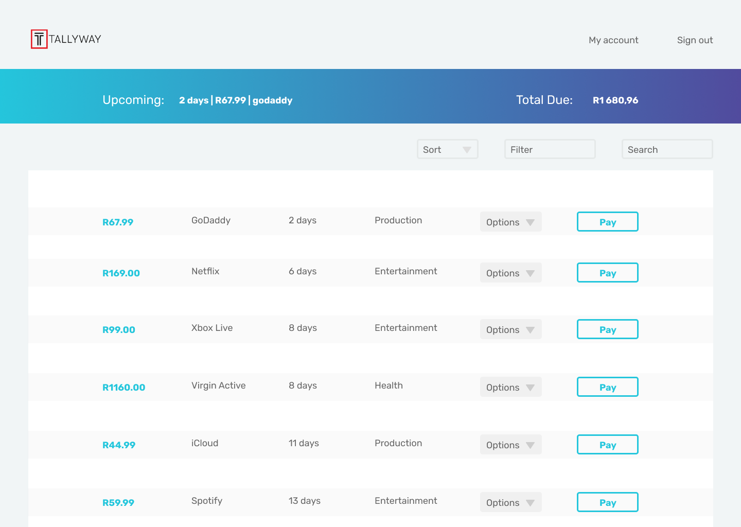
Final UI
Sign up
simple clean design with information so users can sign up to test the product.

Dashboard
- Designed for quick scanning
- Clear hierarchy of information
Cancel Modal
- Prevents accidental actions
- Keeps interaction simple and focused

Outcome
The final design provides users with:
- Better visibility of subscriptions
- Simplified financial awareness
- Quick and intuitive management tools
Reflection
This project strengthened my approach to:
- Designing for clarity over complexity
- Structuring information for usability
- Thinking beyond visuals into user behavior
Future improvements could include:
- Spending insights and analytics
- Smart alerts for upcoming charges